Decreases of usability
Inspired by The Decline of Usability | datagubbe.se, which I would recommend reading.
§ Progress bars
Few decades back progress bars often used to have nice separation with blocks so you could notice progress and count rough percentage easily if a number wasn't present. Nowadays if you don't only get a spinner or some waiting screen (games…) you have a simple-ass line, if there is no percentage next to it, you're basically lost with something where you can only get an idea of the quarters instead of a good indication of the dozens. Imagine having something like your mercure-based thermometer with no units on it.
Nowadays you basically have to keep the pointer on the progress bar to notice progress. Great, as if doing separators was any kind of an hard thing to do.
§ Documentation
I know, 90% of folks do not read them. But it doesn't means that it's completely useless, documentation can allow to repair a program or reimplement it (software rot). Some programs have litterally no documentation for their settings, Firefox is one example of that, specially for the about:config, meanwhile the linux kernel, the thing supposed to be hard to configure, like if you would need to be a confirmed wizard? Well each setting has a nice documentation, there is some pre-made configs for you, you can export/import your settings, and there is /Documentation/ which is useful for the runtime configs or APIs, including internal ones.
§ Scrollbars
I think Ubuntu introduced this one, scrollbars that have something like 5 pixels width maximum and with poping alien buttons when you manage to hover it. Name of the thing in packaged form was named liboverlay and gess what? It looks like it got adopted right into GTK now because I have it on non-configured installs, at least you can toggle it off into GtkSettings (usually lives at ~/.config/gtk-3.0/settings.ini) with gtk-overlay-scrolling = false
As datagubbe pointed out there is also contrast or even just indication issues, sometimes you're left wondering which part is the background and which part is the foreground.
Want some system where the scrollbars are glorious? Plan9. Like the rest of the system the UI is simple as fuck but presents everything well. You get to choose how much to scroll on each click based on the position in the scrollbar or directly at a precise position with another click, meanwhile I had to hard-modify my current mouse so I would have less to no friction on the wheel.
§ Behaviours from other platforms into yours
jwz: Why I use Safari instead of Firefox: I don't want your Linux in my Mac. I want my Mac to behave like a Mac. That's why I bought a Mac.
. Well Firefox… I don't want your Windows into my Linux (or Unix), if you don't want to maintain behaviour consistent to the platform, maybe keeping on simply using GTK or making a small wrapper, or another toolkit would have been better, but no, you did you own NIH with XUL, which you're doomed to be the only one using.
And this isn't about the Operating System or linux patchwork distro taking things from other systems, because this can sometimes be good (but not always, like do not be a clone, this never works in the end). What should never happen is programs that are part of the operating system context to behave differently like a special snowflake. (to me games are the only exception as they are very standalone in terms of interface and OS interaction)
§ Gtk3 ColorChooser
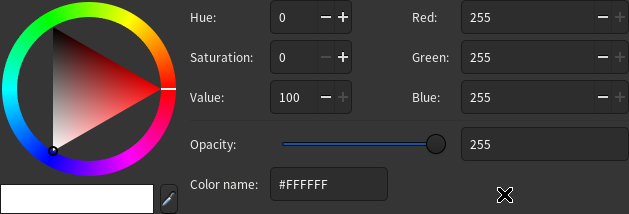
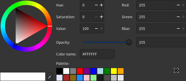
GTK 3 came with the deprecation of the GtkColorSelection, which looks like basically any other colorpicker, you have a colorwheel, a way to tweak your color, optionnally a palette, a picker to grab a color from elsewhere, say your design guidelines and you have an entry where you can put a name or a RBG hexcode.


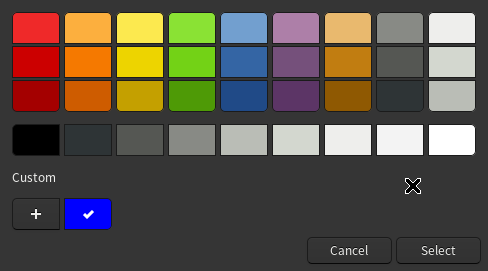
And next you have this bullshit, which is a huge usability failure. You are greated with a palette, now I don't know about everyone but how I do is usually pick a color close enough and adjust it with the color wheel. A bit like painting, you pick some pre-made color and you adjust it. Of course you still have the color wheel by pressing the Plus(+) button at the bottom but no way to go back.
And let me address the bear (gnome2 icon to me is a bear and that got stuck) in the room: Where is the fucking colorpicker? Why is the color name entry stashed away? I need this shit basically all the time, heck I made a Gtk2 application back in 2012 that I used for years mainly for the colorpicker and getting or putting hexcodes.


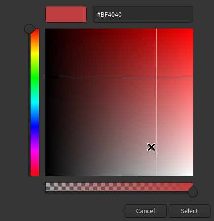
Also I have basically no idea how the ColorSquare works, x axis seems to be for the value, y seems to be saturation, okay fine but where do I find back my colors? Also Hue should always be a wheel, here for example adjusting the hue of red is basically impossible. I think this wasn't done by designers but by pure-coders that saw HSV in a barebone way and re-invented a UI for it from scratch. The only improvement here is the alpha/transparency adjustment. So please go back to GtkColorSelection, put this alpha/transparency under the color wheel and it's done.
And this is the kind of thing which isn't likely to change much until humans gets a way to see more colors (done) and have it fit into something like HSV or RBGA, otherwise it's just something else. and I'm ignoring CMYK because it's for the substractive model which is for paper/painting, while this is for the additive model which is for light (screen, photography, projection), both obeys to a quite different logics/environments and so should probably have different UIs/APIs.